GoodBarber's Online Help
Home page and its widgets
Your home page is the first page displayed on your app after the launching screen.
On this page, you can automatically highlight content from other pages, add call-to-actions, or insert useful links.
You build your Home with widgets.
By default, your application is pre-filled with widgets of different types:
List of collections : contains multiple collections
Search : field allowing a search from your Home page
Product list : list of all the products of a collection
Newsletter: your users can register here to receive your Newsletter
Terms & Conditions: send your users to your terms of use. this widget will always be placed at the bottom of your Home. You can't change its position.
Important: In order to be able to add content widgets on your home page, you need to make sure that you have created the pages you wish to display in your widget first. The widget list depends on the pages published in your app.
Also, certain widgets are unique and can only be added once to the Home:
- Search widget
- Terms & Conditions widget
- Newsletter widget
Set your home page
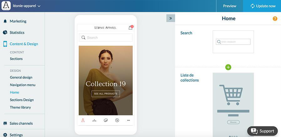
1. Go to the menu Content & Design > Content > Sections
2. Click "Home " from the right panel
The right column shows the widgets list of your home page.

The list of widgets
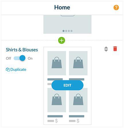
- Click the green "+" to add a widget between 2 widgets,
- Click the red trash to delete a widget,
- Select the up/down arrows to move widgets by drag and drop,
- Name your widget to make it easier to find if you have many,
- Use the ON / OFF button to hide the widget without deleting it,
- Click the "Edit" button to set the fonts, colors, layout, or source of the widget.

Add a widget
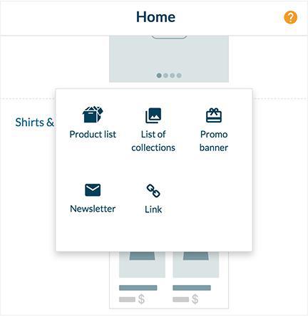
1. Click the green "+" button
2. Select which type of widget you want (Content, Link or others)
3. Set your widget
Note: if you add or remove a section, it will automatically add/remove the widget on the Home page.

Modify or configure a widget
1. Click Edit to configure a widget from the list of widgets.
You can access the different parameters of the widget by scrolling through the column in which you are. We will detail here only the parameters of the widgets of product lists and links, but the behavior is the same for all the widgets.
A / Product List Widget:
Parameters tab
- Widget template: you can choose how the widget is presented.
- Header: depending on the model chosen, if a header is available, you can configure its title, fonts, alignment, colors, etc.
- Content area: depending on the model chosen, several options will be available to define the color and font, info, cell color, pager, etc.
- Content area options: allows you to define sorting options, the number of items, info, etc.
- Global options: depending on the model chosen, it allows you to define the default thumbnail, margin, alignment of content, effect on images, etc.
Source tab
Modify the source of the widget.
B/ Link widget:
- Widget template: you can choose the way the widget is presented.
- Links: allows you to create your links. Click "add a link"
- General settings: depending on the template chosen, it enables you to set the margins, widget background color, fonts, action button, effect on the images etc.
Disable the home page
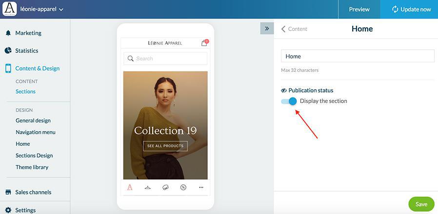
1. Go to the menu Content & Design> Content> Sections menu
2. Click the 3 dots then "Settings" in the right column of your back office
3. Disable the "Display the section" button
If the home is not displayed, the first section in the list of content will be displayed first in the app.

 Design