GoodBarber's Online Help
Global Style
The Global Style menu manages your app's overall design from one single menu.
Colors, fonts, and effects chosen in this menu are applied to every section of your app.
WARNING! Very important: When applying your global style to your app. If you had made some design settings within a particular section of your app previously, those settings will be lost and will be replaced by the new ones set in the Global Style.
Every modification made in this menu will be applied to all sections of your app.
To setup your Global style:
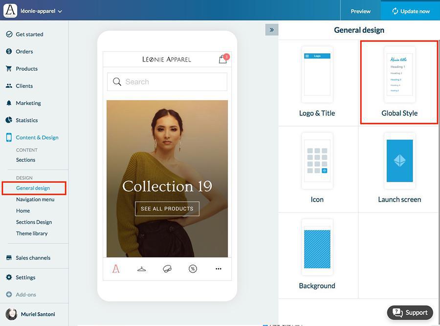
1. Go to the left swipe menu Content & Design > Design >General Design
2. Click "Global Style" on the right column.
To modify the design of a specific section, for in-depth customization, read this online help.
Color scheme
A color scheme* is a combination of colors that go well together. Global Style offers a library of color schemes.
1. Select a color scheme from the ones available
2. To edit an existing color theme, [read point 7]goto:1
*When you choose a color scheme, the colors that it's made up of are applied to different elements of your app.
Once the color scheme has been chosen, it's applied everywhere in the app.
Typography
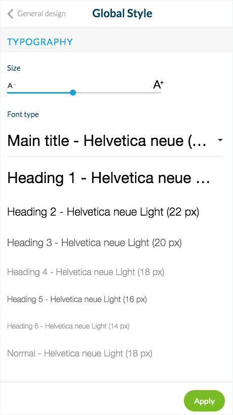
There is a hierarchy for displaying text in the application. 8 levels are used to display titles, subheadings, and the text in paragraphs:
1. Set the text's size using the cursor
Global Style automatically calculates each level's size in order to respect this hierarchy.
2. Select the font for each level
All of the fonts in the Google Font library are available, as well as the native fonts available by default on your users' devices.
3. For each font select its thickness
Buttons
For pages in your app that prompt users to perform an action:
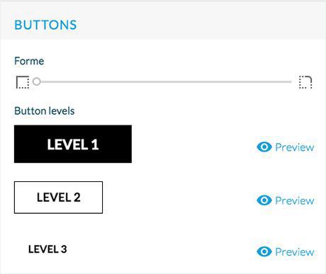
1. Select the shape of the buttons
2. Use your cursor to select the angles of the corners of your buttons , square on the left to more rounded on the right.
Button levels
There are different levels of hierarchy between the buttons. The design of the buttons depends on the color theme of the app, in order to respect the harmony, several variations are proposed for each theme.
Here are the different design for each level:
- Level 1: colored button background, no outline
- Level 2: transparent button background, outline and text in color
- Level 3: transparent button background, no outline
You can preview the rendering of each level by clicking on the "Preview" button.
Hover effects (Desktop PWA only)
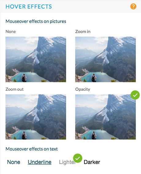
1. Select the effects that appear when hovering the mouse over something.
They are applied on images and hypertext links.
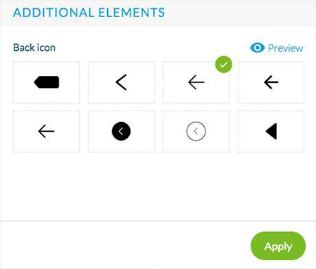
Additional elements
1. Select the icon menu displayed in all your app headers
2. Select the back button displayed in all your app headers
Edit a color theme
Create up to 3 customized color theme
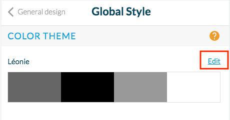
1. Click Edit above your current theme:
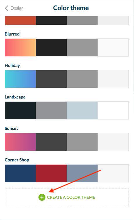
2. Scroll down to the bottom of the page
3. Click the green "Create a color theme" button.
4. Edit the name of your customized theme by clicking the "pencil" icon next to it.
5. Set the colors of your custom theme by zone:
Title zone
These colors will be applied to your header .
Main colors
These colors will be applied to the main part of your apps (title, text and background of your articles pages, or color of the text in your browsing mode for instance)
Secondary colors
These colors will be applied when there is some borders or separators for the left color, the color on the right will be applied as background widget color or tabs background for instance.
App and Menu background
These colors will be applied to your app and menu background color
Buttons
These colors will be applied to the text and the background color of your buttons.
6. Click "Apply"* to apply your new customized global style.
*Every modification made in this menu will be applied to all sections of your app.
Be very careful, when applying your global style to your app, if you had made some design settings within a particular page of your app beforehand, those settings will be lost, and will be replaced by the new ones set your Customized Global Style.
 Design