GoodBarber's Online Help
Elements style
The Elements Style menu manages your app's images and buttons.
Settings chosen in this menu are applied to every section of your app.
WARNING! Very important: When applying your elements style to your app, every modification made in this menu will be applied to all sections of your app except for the margins.
To setup your Elements style:
1. Go to the left swipe menu My App, click "Elements Style " on the right column.
To modify the design of a specific section, for in-depth customization, read this online help.
ELEMENTS TAB:
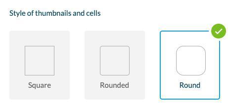
Style of thumbnails and cell
- Select the style that will be applied to your thumbnails and cells of your app
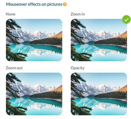
Mouseover effects on pictures (Desktop PWA only)
Select the effects that appear when hovering the mouse over an image.
Buttons
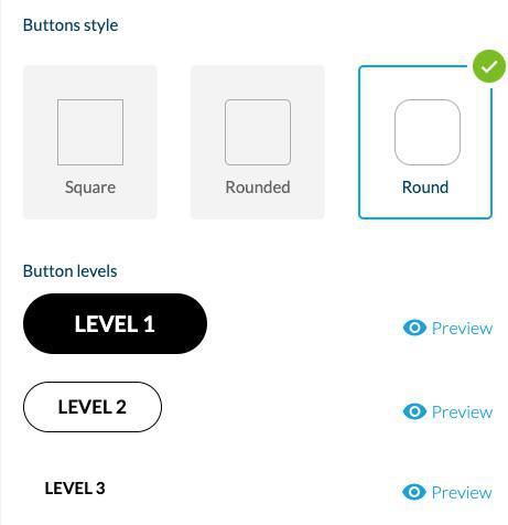
For pages in your app that prompt users to perform an action, there are 3 levels of buttons.
Each level corresponds to different actions in different Sections / Home widgets.
GoodBarber automatically assigns the right level to the button, depending on the action and where is it displayed in the app.
Level 1 button design will always be filled.
Level 2 button design will always be outlined.
Level 3 button design is only a link in text format.
1. Set the shape of the buttons in the Global style menu.
Warning:
- The colors of the button are based on the app's color scheme. You can change the color of a particular button, in each section - design panel or widget settings .
- The level of the button cannot be changed.
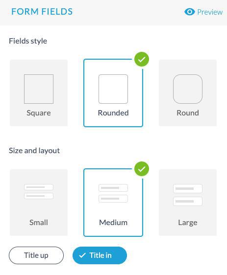
Form fields
Select the style, size and layout for your for sections fields.
Margins
To set specific margins for some parts of your app:
Sections: You can set margins for a specific section via the Advanced edition extension
Home widgets: You can set margins for a specific widget from the widget settings panel
To apply margins globally to your app:
From the Elements Style menu:
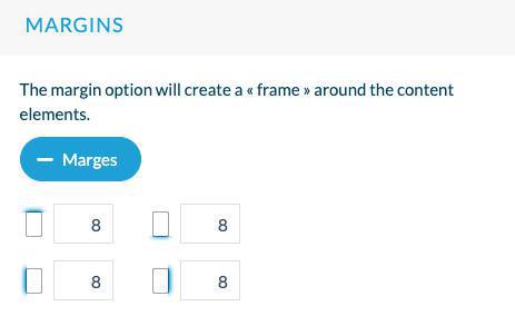
1. Set in pixel the margins you wish to apply
2. A verification will be made for each type of margin (top, bottom, left, and right margins):
If you have set previously specific margins for a section or widget, you'll be asked to either:
- Keep your custom widgets/sections margin settings and apply the global margin settings to the rest of your app
or
- Reset all margins of your app by applying margins set in the Element Style menu instead.
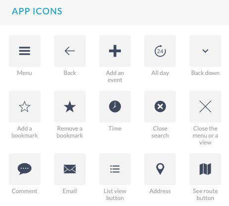
App icons
Select the icons that will be used by default in your app from the library or upload your own icons.
EFFECTS AND ANIMATION TAB:
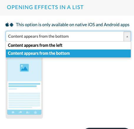
Opening effects in a list
This effect is applied when transitioning from a list view to a detail view of your app only on native iOS and Android versions of your app.
For instance when opening an article page from the list view of your article section.
The content can appear from the bottom of the page of from the left.
You select the option from the drop down menu.
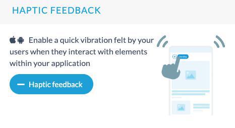
Haptic feedback
Haptic feedback refers to the use of touch and vibrations to communicate sensations or feelings to a user.
Click "Haptic feedback" to activate it for your native apps (iOS and Android only).
Note:
Haptic feedback is only applied to iOS and Android versions of your app, it is not managed on PWA.
The type of vibrations is set by default, it can't be customized.
Android specificities:
- Haptic feedback is only managed on devices running Android 11 and above.
- Some devices allow users to adjust the haptic vibration intensity in more detail from the device settings app.
- Some devices might not manage haptics properly due to a layer added on top of stock Android. On these devices, users can disable haptic feedback from the app settings section.
 Design