GoodBarber's Online Help
Apple Rejection: Design - Minimum Functionality
The message from Apple
We found that the usefulness of your app is limited by the minimal amount of content or features it includes.
Next Steps:
We encourage you to review your app concept and incorporate different content and features that are in compliance with the App Store Review Guidelines. We understand that there are no hard and fast rules to define useful or entertaining, but Apple and Apple customers expect apps to provide a really great user experience.
Apps should provide valuable utility or entertainment, draw people in by offering compelling capabilities or content, or enable people to do something they couldn't do before or in a way they couldn't do it before.
What should I do?
Assuring that your app has great functionality is not only the key to success in the world of mobile apps but it is also crucial to have your app published on the App Store. The rejection above will occur if Apple’s Review team considers that your app looks unfinished, that your app concept is not perceptible or adequate to the standards of the App Store.
As Apple says, there are no hard and fast rules to define what's useful or entertaining and we cannot provide a solution ourselves. As the developer of your app, you should be aware and critical of your own work, and find the best solution according to the purpose of your app.
However, we can still point some “do’s and don'ts” based on the experience of the GoodBarber team:
Have a great app concept
Apple values quality apps on the App Store, apps that provide a great user experience in a way a website / a web app couldn't.
If you haven't already, you need to define the concept of your app to match the quality standards of Apple.
It is no longer enough for an app to provide content alone.
Ask yourself simple questions:
- Is this app for marketing purpose only?
- Is this app a catalogue/showroom only?
They key is to engage your users, give them the interest to download and keep your app. Let them do something they couldn't do without your app, basically.
GoodBarber provides various pages and features that allow you to do so.
Engage your users
Apple values apps that provide channels for user interactivity.
One of the native iOS features that is present on all GoodBarber apps is the Push Notifications.
But push notifications alone only allow to send information to your users.
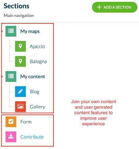
Move to the next level and get feedback from your users with native features to your app such as Form pages or the Submit page. No doubt they will appreciate an app which allows the end-users to express themselves and send you messages or even content (that you can later integrate into your app).
Keep in mind that highly engaging apps create great user communities around them, you can also add User Authentication, User Community or the Chat.
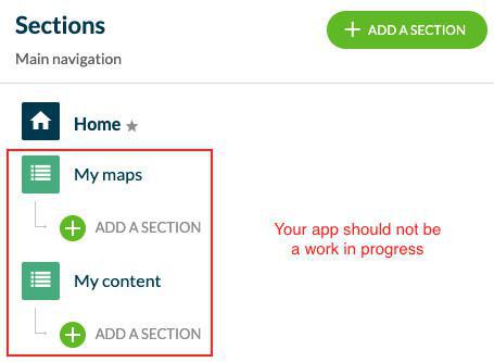
Don’t try to get your app approved before it is completely finished
A work in progress won’t be accepted at the App Store for distribution, so be sure that your app provides an acceptable number of features and content that suit its concept.
That means:
- No fake articles,
- No empty articles or pages,
- No mention of test, placeholder, or anything that would lead Apple to believe your app isn't complete.
Of course, you can add more content later, but at the moment you publish your app, it needs to look finished to your users.
You wouldn't buy an incomplete service or merchandise at the supermarket. Neither would your users download a work in progress from the App Store.
Offer a solid native experience
GoodBarber provides a wide range of native features which allow you to build great and beautiful apps;.
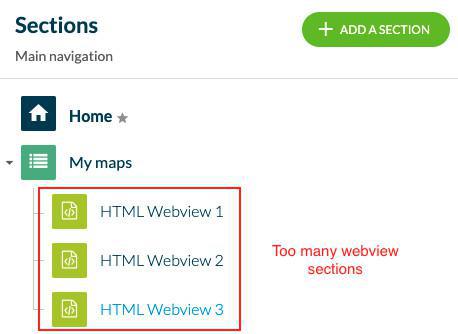
As long as a native alternative is available, please avoid using web views, especially if these web pages are not mobile responsive.
Apple will reject apps which look like web apps, it is written in their guidelines.
On the other hand, if you are trying to build an app mostly based on web-views, maybe you’ll be interested in creating a Progressive Web App.
Make sure that all pages display content
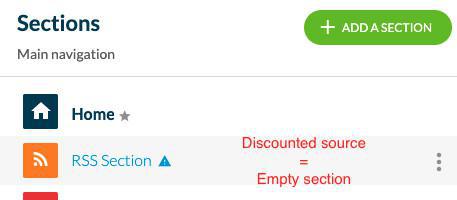
Pay special attention if you are using connectors (Wordpress, Live Radio, Youtube, etc.) to make sure those are properly set. If not, the page concerned will display a warning sign in gray.
Offer more than promotional or advertising material
Your apps should offer more than simply advertise your products or services. There are very interesting ways to convey your message in an engaging manner.
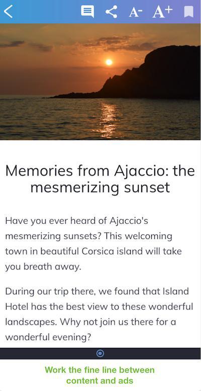
This may include working the fine line between ads and content by creating a feed of content using our powerful CMS feature. This also applies to the use of ads inside the app: even though ad networks provide an excellent monetization strategy, avoid overwhelming your users with information.
The design should be clear and intuitive
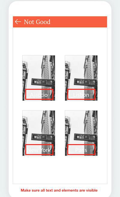
You want your users to grasp the functionality of your app very easily, therefore its design should be clear and appropriate. It is important to not clutter the visual space of your users, so avoid a too strong and diverse color palette, poor contrast, or fonts that are hard to read.
Make sure that your app’s metadata reflects the concept of the app
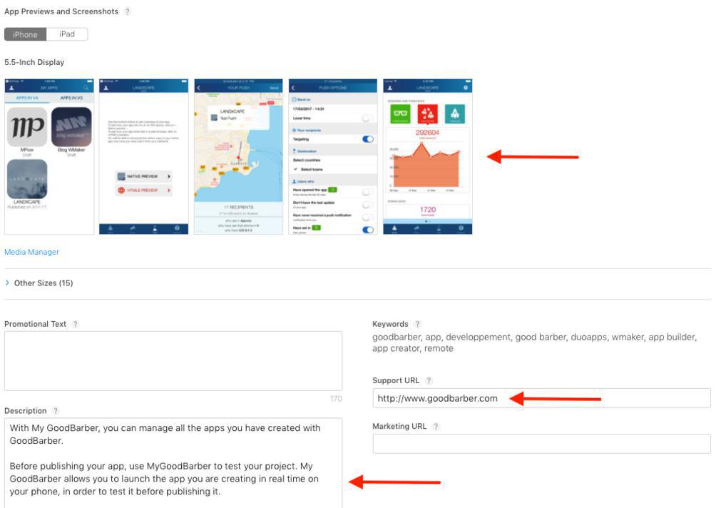
There are millions of apps in the App Store for users to choose from, so be sure that your store listing makes clear what the concept of your app is, and that this information is not deceiving. This will also be important to increase your app’s visibility and popularity.
Looking for inspiration? Then take a look at the Showcase of beautiful apps we offer at the GoodBarber Blog .
 Design